
The pie-chart provided below gives the distribution of land areas used for various food crops : Choose the correct option from the following which uses more than 50% of the total area.
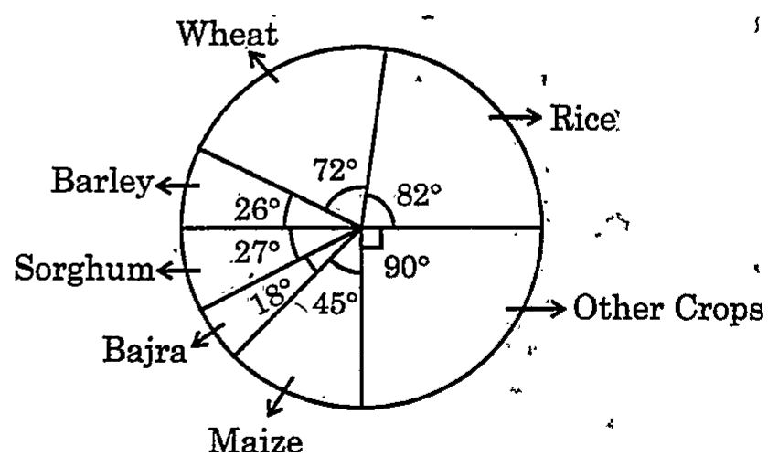
- (1)Wheat, Barley and Sorghum
- (2)Rice, Wheat and Sorghum
- (3)Rice, Maize and Barley
- (4)Bajra, Maize and Rice
Answer
Why
Correct — option (2), Rice, Wheat and Sorghum.
More than 50% of the total area means more than half the pie: more than 360° ÷ 2 = 180°.
Step 1 — read the sector angles from the chart.
Wheat 72°, Rice 82°, Other Crops 90°, Maize 45°
Bajra 18°, Sorghum 27°, Barley 26°
Check: 72 + 82 + 90 + 45 + 18 + 27 + 26 = 360°
Step 2 — add the angles in each option.
Option (1): 72 + 26 + 27 = 125°
Option (2): 82 + 72 + 27 = 181°
Option (3): 82 + 45 + 26 = 153°
Option (4): 18 + 45 + 82 = 145°
Step 3 — compare with 180°. Option (2) is the one above it: Rice, Wheat and Sorghum make 181°, and 181 ÷ 360 × 100 ≈ 50.3% of the area.
A look at the chart confirms it. The horizontal line through the centre cuts the pie into two halves of 180°. Barley (26°), Wheat (72°) and Rice (82°) fill the top half.
Sorghum (27°) is 1° larger than Barley, so swapping Barley for Sorghum takes the total to 181°, just past half.
The idea to remember: in a pie chart, share (%) = angle ÷ 360 × 100, so more than 50% means more than 180°.
Why the others are wrong
- (1)Wheat, Barley and Sorghum — Wheat, Barley and Sorghum make 72 + 26 + 27 = 125°, which is 125 ÷ 360 × 100, about 34.7% of the area.
That is well short of 180°. Replacing Barley (26°) with Rice (82°) would raise the total to 181°, the set in option (2).
- (3)Rice, Maize and Barley — Rice, Maize and Barley make 82 + 45 + 26 = 153°, which is 153 ÷ 360 × 100 = 42.5% of the area.
Barley, Wheat and Rice fill exactly 180°. This set has Maize (45°) in place of Wheat (72°), so it falls 27° short of half.
- (4)Bajra, Maize and Rice — Bajra, Maize and Rice make 18 + 45 + 82 = 145°, which is 145 ÷ 360 × 100, about 40.3% of the area.
Bajra, at 18°, is the smallest sector in the chart, so this set stays well below the 180° needed for more than half.
Concept
A pie chart shows how a whole is divided. The full circle is 360°, and each sector's angle is proportional to its share: angle = (part ÷ total) × 360°.
Reading it back, share (%) = angle ÷ 360 × 100. Useful markers: 180° is 50%, 90° is 25%, 36° is 10% and 3.6° is 1%.
Shares can be compared and added directly as angles. Actual quantities, such as hectares under a crop, need the total to be given; the chart alone gives proportions.
A straight line through the centre marks off exactly half the pie, which gives a quick visual check against 50%.
RPSC's 2024 syllabus for Reasoning & Mental Ability lists "Data Analysis (Tables, Bar diagram, Line graph, Pie-chart)" under Basic Numeracy.
Pie charts suit part-to-whole data such as the area under different crops, the heads of a budget or the sources of revenue. Bar diagrams and line graphs suit comparisons across categories or over time.
Working with a pie chart is percentage arithmetic in degrees, so it draws on the same skills as the Percentage topic in the syllabus.
Key facts
- The sectors of a pie chart add up to 360°; sector angle = (part ÷ total) × 360°.
- Percentage share = sector angle ÷ 360 × 100; 180° is 50%, 90° is 25% and 36° is 10%.
- A pie chart without a stated total gives shares only; actual values need the total.
- In this chart Barley, Wheat and Rice add up to 26 + 72 + 82 = 180°, exactly half the area.
- In this chart Rice, Wheat and Sorghum add up to 181°, about 50.3% of the area.
Angles from the chart: Wheat 72°, Rice 82°, Other Crops 90°, Maize 45°, Bajra 18°, Sorghum 27°, Barley 26°.
Study next
Common traps
- Reading "more than 50%" as "at least 50%". Barley, Wheat and Rice make exactly 180°, which is 50% and not more.
- Comparing a total of angles with 50 instead of 180. The sectors are in degrees, and half of the pie is 180°.
- Confusing the two neighbouring small sectors. Barley (26°) and Sorghum (27°) differ by 1°, and that 1° decides whether a set crosses half.
A question can ask which group of sectors passes a given share, what percentage one sector is, or the actual value of a sector once the total is given.
A question can also compare two pie charts with different totals, such as a family's spending in two months.
Related PYQs
UnlockIAS will link similar questions from RAS Pre 2021 and 2013 here once those papers are published on this site.
Practice
- practice — not a real PYQ
In a pie chart of a family's monthly expenditure, the sector for food measures 108°. If the total monthly expenditure is ₹ 30,000, how much is spent on food?
- (a)₹ 9,000
- (b)₹ 32,400
- (c)₹ 3,000
- (d)₹ 12,000
Answer(1) — Food's share = 108 ÷ 360 = 30%, and 30% of ₹ 30,000 = ₹ 9,000. Option (2) reads 108° as 108%; option (3) is the amount for a 36° sector (10%); option (4) would need a 144° sector. - practice — not a real PYQ
A pie chart shows a household budget with sectors Food 120°, Rent 75°, Education 95° and Savings 70°. Which two heads together account for less than 45% of the budget?
- (a)Food and Savings
- (b)Rent and Education
- (c)Rent and Savings
- (d)Education and Savings
Answer(3) — 45% of 360° is 162°. Rent and Savings make 75 + 70 = 145°. Option (1) makes 190°, option (2) 170° and option (4) 165°, all above 162°.