
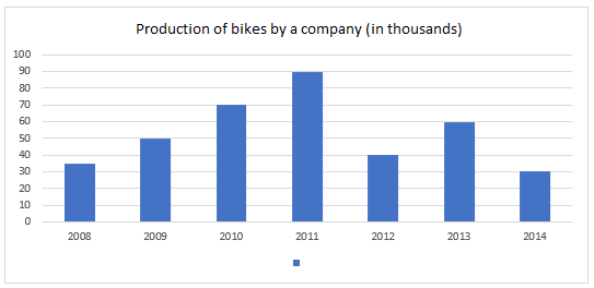
The given bar graph shows the production of bikes by a company (in thousands) over the years. In how many of the given years was the production of bikes more than the average production of bikes over the years?.
- (a)2 years
- (b)1 year
- (c)4 years
- (d)3 years
Answer
Why
Correct — D. Read the seven bars first, in thousands:
2008 = 35, 2009 = 50, 2010 = 70, 2011 = 90, 2012 = 40, 2013 = 60, 2014 = 30
Add them in order, keeping a running total:
35 + 50 = 85
85 + 70 = 155
155 + 90 = 245
245 + 40 = 285
285 + 60 = 345
345 + 30 = 375
Average = 375 ⁄ 7 = 53.57 thousand, near enough.
Now compare each bar with 53.57:
above — 2010 (70), 2011 (90), 2013 (60)
below — 2008 (35), 2009 (50), 2012 (40), 2014 (30)
That is 3 years → option (d).
Why the others are wrong
- (a)2 years — 2 years drops 2013, whose bar reads 60. The average is 53.57, so 60 clears it comfortably. It is also what you get by dividing the total by 6 instead of 7, which raises the bar to 62.5.
- (b)1 year — 1 year answers a different question — which single year was highest. That is 2011 at 90, but three bars stand above the average, not one.
- (c)4 years — 4 years counts 2009 in, and its bar reads 50 against an average of 53.57. The gap is only 3.57, which is exactly why the average has to be computed rather than eyeballed.
Concept
The whole item is one number: the average, 375 ⁄ 7 = 53.57 thousand. Everything after that is a comparison you can make at a glance.
Add the bars in the order they stand rather than hunting for convenient pairs. Seven small additions with a running total are quicker, and easier to re-check, than regrouping.
Then note only where the average lands: between 50 and 60. That single fact decides all seven bars — the three at 60, 70 and 90 are above it, and the four at 50 and below are not.
2009 is the bar that costs marks. At 50 it sits just 3.57 below the average, close enough that a candidate who rounds the average to "about 50" counts it in and answers 4 years.
No bar is exactly equal to the average here, so the phrase "more than the average" needs no tie-breaking.
Key facts
- The seven bars read 35, 50, 70, 90, 40, 60 and 30 thousand for 2008 to 2014 in order.
- Their total is 375 thousand, so the average is 375 ⁄ 7 = 53.57 thousand.
- Three years stand above that average: 2010, 2011 and 2013.
Study next
Common traps
- Rounding the average down to 50 and counting 2009 in, which gives 4 years.
- Dividing the total by 6 instead of 7 after miscounting the bars, which gives 62.5 and only 2 years.
- Comparing the bars against the tallest bar instead of against the average.
The graph is deliberately plain — the marks sit in the arithmetic, not in the reading.
This shift pairs it with Quant Q.21, a two-year bar graph asked as a percentage of one branch against another, and Quant Q.9, a table asked as a ratio against an average.
Related PYQs
No directly related past PYQ was found.