
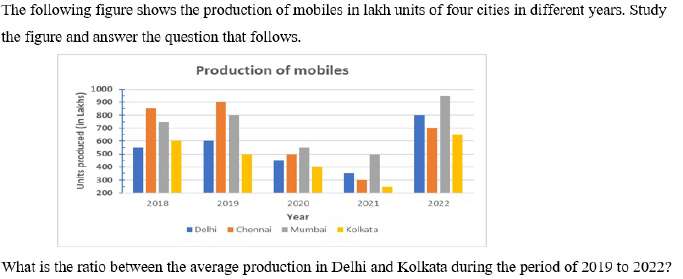
The following figure shows the production of mobiles in lakh units of four cities in different years. Study the figure and answer the question that follows. Production of mobiles Units produced (in Lakhs) Year → 2018 | 2019 | 2020 | 2021 | 2022 Delhi — 550 | 600 | 450 | 350 | 800 Chennai — 850 | 900 | 500 | 300 | 700 Mumbai — 750 | 800 | 550 | 500 | 950 Kolkata — 600 | 500 | 400 | 250 | 650 What is the ratio between the average production in Delhi and Kolkata during the period of 2019 to 2022?
- (a)11 : 9
- (b)13 : 7
- (c)11 : 7
- (d)13 : 9
Answer
Why
Correct — A. The window is 2019 to 2022, so the 2018 group is not read at all.
Delhi: 600 + 450 + 350 + 800 = 2200
Delhi average = 2200 ⁄ 4 = 550
Kolkata: 500 + 400 + 250 + 650 = 1800
Kolkata average = 1800 ⁄ 4 = 450
Ratio = 550 : 450, and dividing both by 50 gives 11 : 9 → option (a).
Why the others are wrong
- (b)13 : 7 — 13 : 7 misses on both sides at once. It needs a Delhi total of 2600 and a Kolkata total of 1400; the four bars give 2200 and 1800.
- (c)11 : 7 — 11 : 7 keeps Delhi's 11 but needs Kolkata's four-year total at 1400 instead of the 1800 the bars give — one Kolkata bar read 400 units too low.
- (d)13 : 9 — 13 : 9 keeps Kolkata's 9 but needs Delhi's total at 2600 rather than 2200 — 400 units too high spread across the four years.
Concept
Bar-graph DI rewards two habits. First, read the window the question names: 2019 to 2022 is four groups, not the five drawn.
Second, both averages divide by the same 4, so the ratio of the averages equals the ratio of the totals. 2200 : 1800 reduces to 11 : 9 without ever computing 550 or 450.
The chart plots four cities side by side in each year, so the second habit is really about picking the right two bars out of each group of four before adding anything.
The y-axis begins at 200, not 0, so the bars are truncated and their heights are not proportional to the values. Kolkata's 2021 bar looks tiny beside Delhi's 800 in 2022 but reads 250. Take the number off the axis, never the height.
Key facts
- Delhi's bars for 2019, 2020, 2021 and 2022 read 600, 450, 350 and 800 lakh units.
- Kolkata's bars for the same four years read 500, 400, 250 and 650 lakh units.
- When two averages cover the same number of years, the ratio of the averages equals the ratio of the totals.
- The graph's vertical axis runs from 200 to 1000, so no bar starts at zero.
Study next
Common traps
- Averaging all five years when the question names 2019 to 2022.
- Dividing each total by 4 before forming the ratio, which is extra work that cancels.
- Comparing bar heights by eye instead of reading the axis values.
The same grouped bar chart is asked as a ratio here and as a percentage elsewhere.
On 11 Sep 2024, 09:00, Quant Q.10 a coffee-production bar graph puts the combined four-year average of companies A and C against that of B and D and asks whether it is more or less, and by what percentage rounded to two decimals.
Its four options pair the two directions, and the key is Less, 7.81% — read the direction before you compute.
Related PYQs
No directly related past PYQ was found.