
 View answer copy →
Suvan SharmaRank 412CSE 2023scored 10m
Answered a very similar question
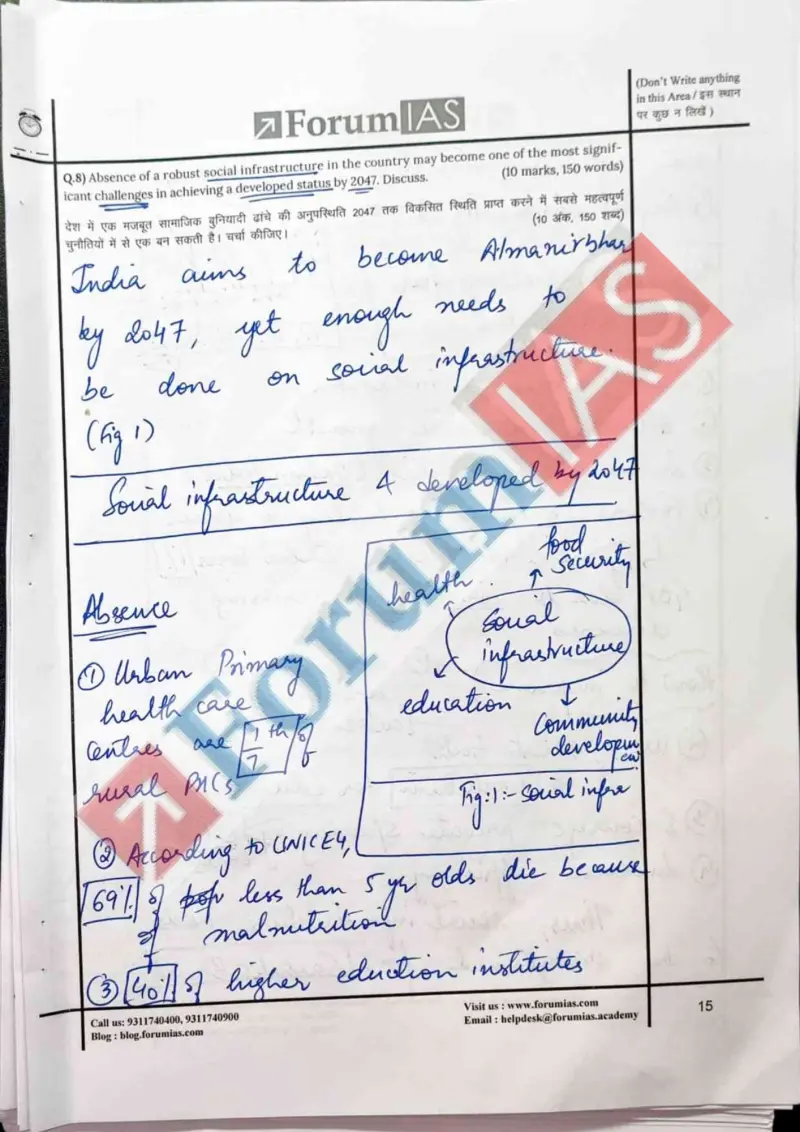
Their question: “Social infrastructure as a challenge to developed-India status by 2047 (10m)”
The same sourced social-sector deficit data is exactly the evidence needed to examine why India's high growth coexists with low human-development indicators and elusive inclusive development.
Key learnings from their answer
- ›His Q8 (social infrastructure) is a stat barrage with sources attached, not vague claims: UNICEF 69% under-5 deaths, 40% of higher-ed institutes unaccredited, urban PHCs ~1/7th of rural, NSS-2017 digital divide (42% urban / 15% rural / 24% India), India losing ~1% of GDP to air pollution, social expenditure at 1.2%. -> Build a small bank of figures-with-source for your core themes so a body paragraph reads as evidence, not opinion, and always tag the source (UNICEF, NSS-2017) to make the number land.
- ›Diagrams are integrated as analysis, not decoration: a Q15 'Deprivation' mind-map splitting Extent vs Source (caste/class/regional/gender) vs Complexity that feeds into 'Informed policymaking', a Q8 bar chart plotting the actual NSS-2017 42/15/24 digital-divide numbers, and a hand-drawn Indo-Pacific map in Q20. -> Make each visual do argumentative work, a labelled chart that carries your own data or a mind-map that classifies causes adds value, whereas a generic box-and-arrow does not.
What they cited: UNICEF 69% under-5 deaths; 40% higher-ed institutes unaccredited; urban PHC ~1/7th of rural; NSS-2017 digital divide 42%/15%/24%; India loses ~1% GDP to air pollution; social expenditure 1.2% (Q8)