 View answer copy →
Kanchan ChoudharyRank 408CSE 2023
Answered a very similar question
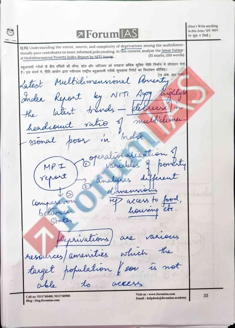
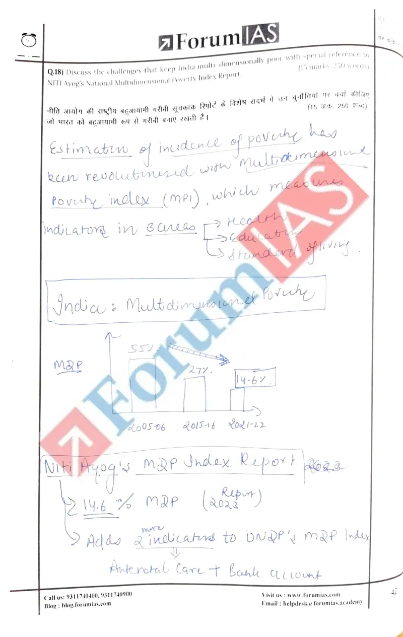
Their question: “Multidimensional poverty; NITI Aayog National MPI Report (15m)”
Her quantified MPI trajectory and spatial disparity map are the model template for analysing the Multidimensional Poverty Index and the incidence-and-intensity-vs-income argument this PYQ makes.
Key learnings from their answer
- ›On Q18 (multidimensional poverty) she made the trend measurable: a bar chart tracking MPI falling ~55% -> ~27% -> 14.6% across the 2005-06 / 2015-16 / 2021-22 rounds, plus a hand-drawn India map to show regional disparity. -> Convert a 'discuss poverty/development' answer into a quantified trajectory (cite the actual numbers across survey rounds) and add a spatial layer for disparity, rather than describing decline with adjectives.
- ›Visually rich: cloud-bubble call-outs, flow/tree charts, an India map, a BRICS world map, an MPI bar chart and a court-pendency pyramid.